


THE TOY CART
E-commerce toy store for curated toys


Overview
The Toy Cart is a 30-year-old retail store that needs an e-commerce website.
Team & Duration
A solo project at General Assembly UXDi Winter 2015 Duration: 2 Weeks.
Tools & Methods:
Stakeholder interview, Card sorting, Personas, User Flow, Information Architecture, Comparative & Competitive Analysis, Tools: Pencil & Paper, Sketch3, Invision
CHALLENGE
The Toy Cart is a retailer of toys, games and magic tricks for the past 30 years. It wants to have a web presence now to appeal to the new generation. The challenge is to create a prototype for a website for to be able to shop online to meet both the user goals and the business goals. The tasks are to create a navigation scheme, design flows for the major user journeys and wireframes for each page required to illustrate the user's journey.
SOLUTION
Navigation Schema:
Using the 100 top selling products as a guide, I organized the site into logical and meaningful categories. For that, I conducted both open and closed card sorting - both manual and using X-sort . That lead to forming the information architecture.


IDEATION
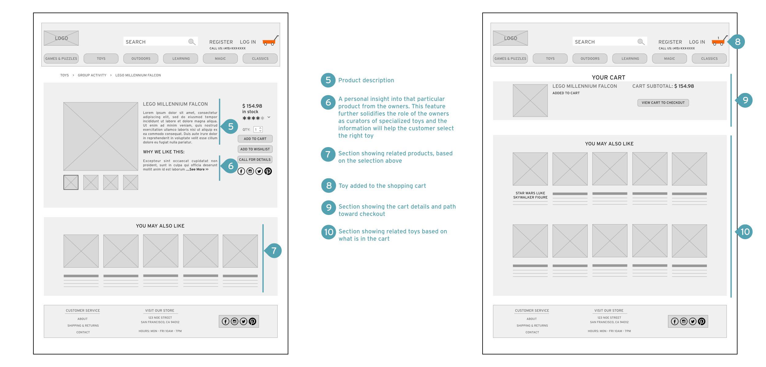
Wireframes were done first with pencil and paper to decide the scheme. After going through a few iterations and understanding the client's needs, I decided to feature a carousel of images displaying the essentials of the store on the home page as the central theme of that page, as opposed to featuring products as the central theme. This was done to portray the uniqueness of the store and its place within the San Francisco toy market. This feature also gave the client an opportunity to tell their story and create a sense of connection with the visitor of the website.
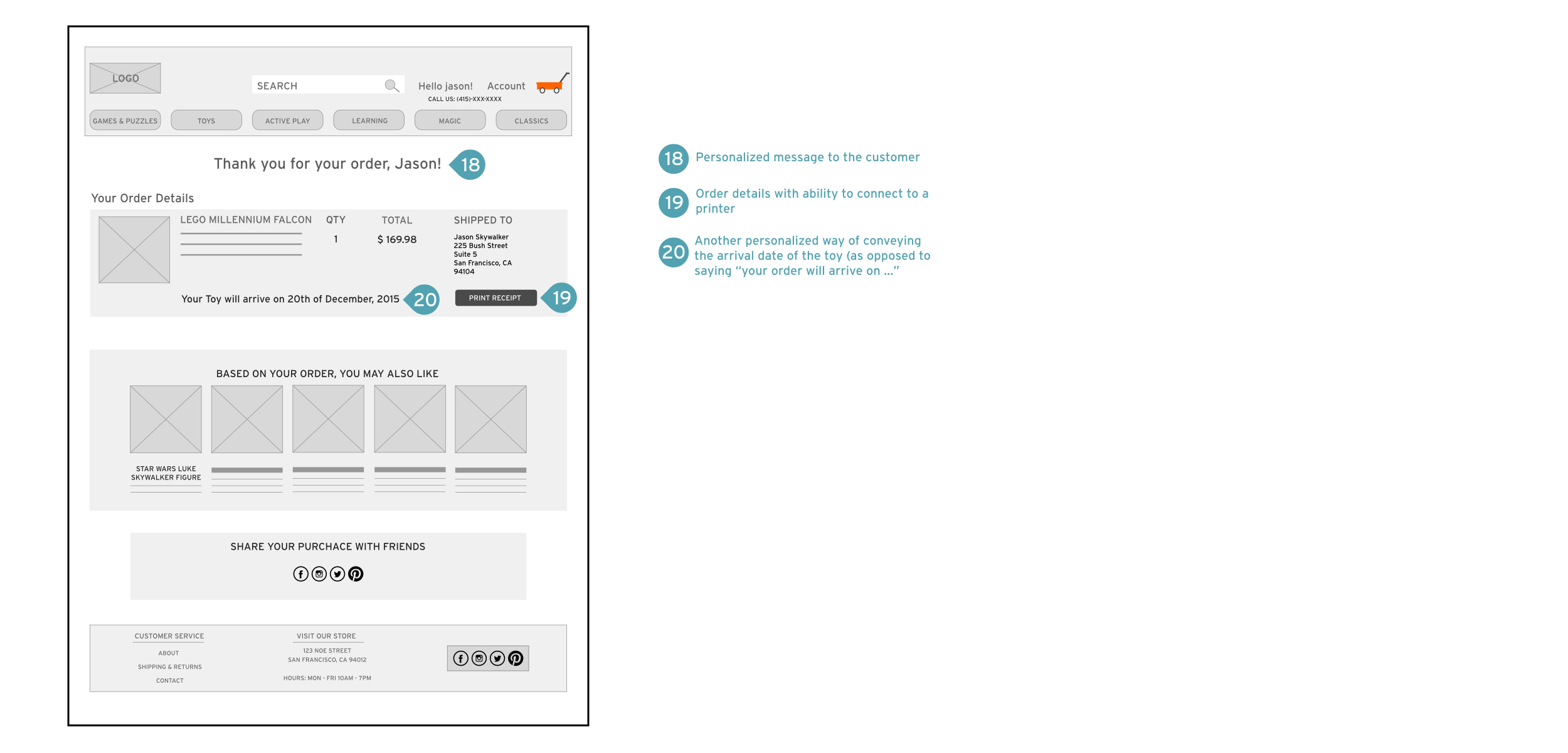
Few other features that gave the user a personal feel while navigating were added on the wireframes. Features such as "Why we like this" on the product description page shared the client's story about the product and a brief history. The checkout flow kept the view of the product to give clarity.


More selected projects

